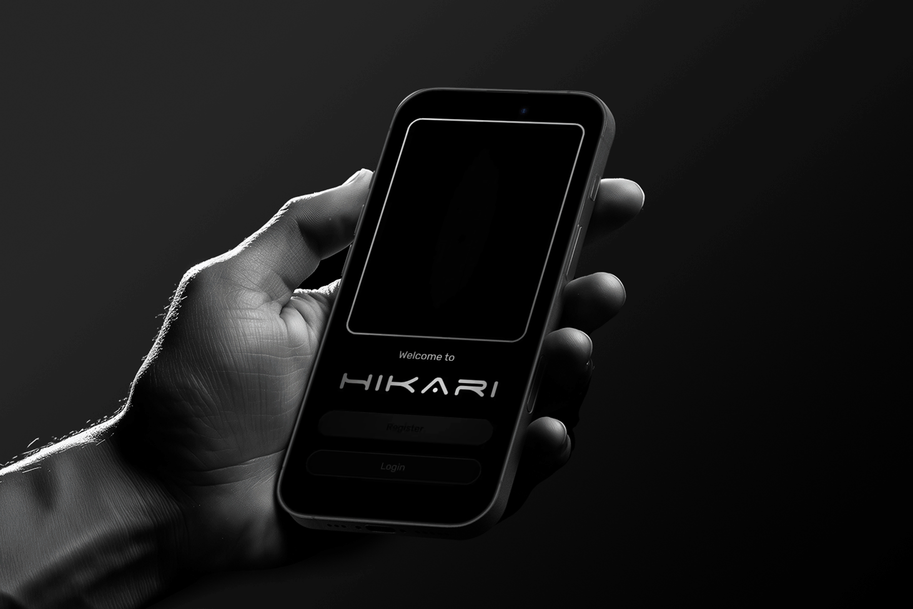
HIKArI
Smart Lighting Control App
The problem
Setting right colors for right mood can feel chaotic and frustrating—even for experienced users.
Despite the growing trend in connected home systems, most apps fail to offer a seamless and intuitive experience.
Users struggle with confusing setup flows, overwhelming feature overload, and performance reliability issues undermining the potential of ambient smart lighting to transform everyday environments.
PROCESS
User research and synthesis, ideation, prototyping, interaction, usability testing
ROLE
UI/UX Designer, End-to-End Designer
TOOLS
Figma, Photoshop, Illustrator
DURATION
6 weeks
STEP 3
STEP 4
IDEATE
to create the app design
PROTOTYPE
to create an app for testing
STEP 1
EMPATHIZE
with the users through interviews and market research
STEP 5
TESTING
by asking users to perform tasks in the app
STEP 2
DEFINE
the design statement
empathize
I interviewed 5 designers, 5 engineers, 5 developers, and 5 end users, ensuring that both the user’s experience and the creator’s experience were equally represented.
This approach allowed me to uncover pain points from those who design and build these systems as well as those who live with them daily.
I developed detailed personas to capture their goals, frustrations, and needs, and identified recurring themes—ranging from complex setup processes to cluttered interfaces and unreliable performance.


To truly understand the challenges of setting the right colors for the right mood, I began by speaking directly with those who interact with smart lighting from different perspectives.
This empathy-driven foundation shaped the project’s direction, ensuring that the final design addresses problems holistically, not just cosmetically.
"Complex and unintuitive setup process"
50%


"Overwhelming interface and feature clutter."
30%
"Poor app performance and reliability."
20%


Needs
Needs
Needs
"App design that manages user expectations with clear feedback during loading and error states and limits resource-heavy operations to maintain smooth performance."
"Clean, focused interface and logical navigation so that users of all levels can intuitively control lighting without feeling lost or overwhelmed."
"Streamlined, guided setup flow to pair devices without technical hiccups, allowing focus on lighting design rather than troubleshooting."
INSIGHTS
"Simple and predictable setup gives confidence to recommend the product to others, increasing adoption of smart lighting solutions in professional projects."
INSIGHTS
"Essential controls in a clear hierarchy make users feel empowered and engaged, leading to more frequent and satisfying interactions."
INSIGHTS
"Transparent communication of status and gracefully handling delays or failures keeps the users patient and confident in the product."
The Engineer
The Creator
The Developer
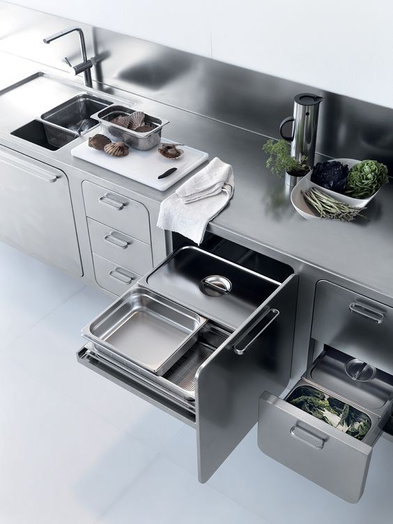


KITCHEN
WORK
LIVING
BEDROOM
Fresh
Hungry
Colorful
Familiar
Hygienic
Relaxed
Romantic
Nostalgic
Peaceful
Pleasant
Focused
Fresh
Productive
Inspiring
Practical
Active
Neutral
Stressed
Exposed
Tiring
Warm
Energy
Relaxed
Party
Cozy
Dull
Happy
Nostalgic
Romantic
Calm
Warm
Familiar
Playful
Romantic
Sad
Happy
Nostalgic
Tiring
Anxious
Cozy
"Post-update, the lights reset to default settings instead of my saved preferences after power cycling."
"Fantastic functionality with versatile color options; a scheduling feature would be a welcomed addition."
"Exceptionally bright and adaptable lighting, with an array of colors and themes for diverse atmospheres; seamless integration with Alexa – I love it!"
"I appreciate the functions but seek a simpler, less content-heavy interface for ease of use."
"Experienced multiple apps; looking for automatic color settings to simplify the process."
Other Comments
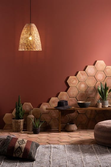
For example, warm, soft tones in a bedroom can promote relaxation, while bright, cool lighting in a workspace can enhance focus.
Each room’s psychological impact was considered to understand how lighting could amplify or transform the user’s experience.
This analysis informed the app’s color and scene presets, ensuring that every lighting adjustment aligns with the emotional intent of the space.
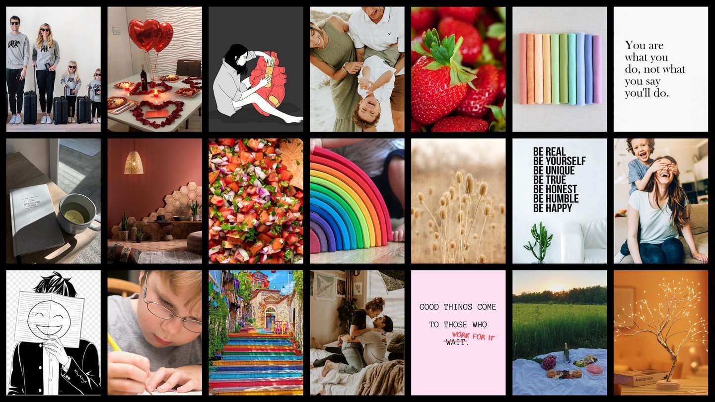
To design an app that could genuinely enhance mood through lighting, I conducted a qualitative research and mood analysis of different home spaces. This involved observing and documenting how lighting, color schemes, furniture arrangement, and overall ambiance influence a person’s emotional state and it became evident that lighting significantly influences emotional and physiological states.
The research revealed recurring pain points: complex setup processes, overwhelming interface clutter, and inconsistent performance that frustrate even tech-savvy users.
Competitors often attempt to pack in every possible feature, but in doing so, they sacrifice clarity, speed, and intuitive interaction.
By mapping these shortcomings against user expectations, I was able to pinpoint a clear gap for a streamlined, reliable, and emotionally engaging lighting control experience.
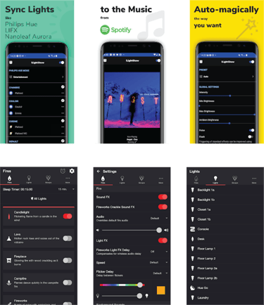
To identify opportunities for improvement, I conducted an in-depth analysis of existing smart lighting apps currently available in the market.
This review focused on user reviews, app store ratings, feature sets, and overall usability.
How might we design a simple and intuitive UI with easy setup, reduce interface clutter, and ensure reliable performance, so users can experience effortless personalization of colors to set the mood?
My research led me to ask....
define
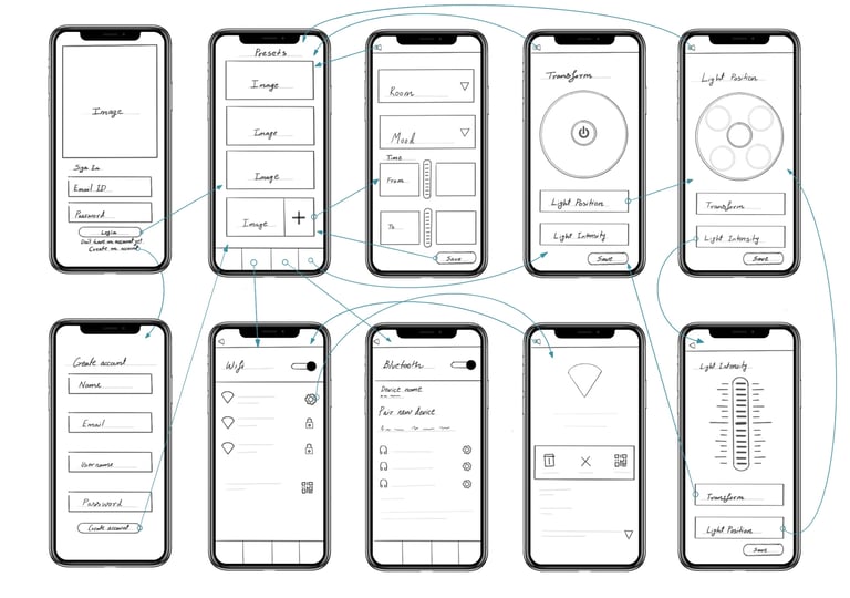
Building on the insights from research and mood analysis, I began translating ideas into low-fidelity wireframes to explore different ways the app could deliver a seamless and engaging user experience.
These early sketches focused on streamlining navigation, reducing interface clutter, and creating clear pathways for users to personalize lighting with minimal effort.
By rapidly iterating on layout concepts, I was able to visualize multiple interaction flows and test how the design could balance simplicity with functionality, ensuring the emotional intent of mood lighting with right colors was preserved without overwhelming the user.
ideate

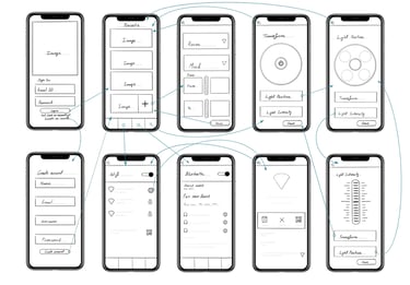
At the mid-fidelity stage, I translated the low-fidelity frames into functional wireframes that focus on layout, navigation, and hierarchy without visual distractions.
These frames demonstrate how users move from login and onboarding to setting up rooms, moods, and routines, while also exploring light position control and intensity adjustments.
By stripping away aesthetic elements, the mid-fidelity frames allowed me to validate the flow, ensure clarity, and refine core interactions before investing in detailed design.
Prototype
User-Centric Interactions
Key features such as customization of moods, presets, and light positioning were fully fleshed out to capture real-world usability.
By designing detailed flows for registration, login, device setup, and personalization, I ensured that both new and returning users could navigate the app seamlessly.
These prototypes reflected the intended simplicity and reliability, aligning directly with the project’s problem statement and “How might we” question.
Feedback-Oriented Prototype
The high-fidelity prototype was not just for presentation it was designed as a feedback tool.
By providing realistic visuals and interactive flows, I enabled users and stakeholders to test scenarios, evaluate usability, and identify areas for refinement.
This stage bridged the gap between design vision and user expectations, setting a strong foundation for iterative improvements.
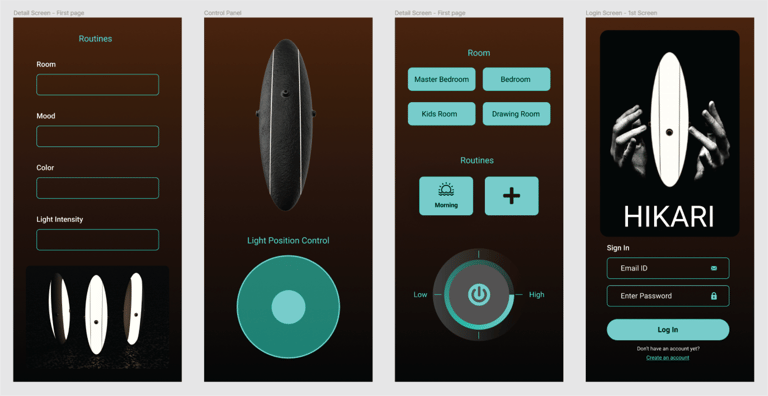
High-Fidelity Frames
Building on the mid-fidelity structure, I developed high-fidelity wireframes to simulate a near-final product experience.
These screens incorporated a refined monochromatic palette that highlights displayed colors while keeping the interface minimal and distraction-free.
The goal was to make the visual hierarchy clear and ensure every interaction feels intuitive and purposeful.
User Feedback
"Introduce a back button option for navigation convenience."
"Refine the light settings flow for improved user experience."
"Implement a library for saving lighting moods."
"Enhance control features for color and mood customization."
"Reiterate the light navigation page to optimize user guidance."
"Make the UI more modern (iOS Liquid Glass)."


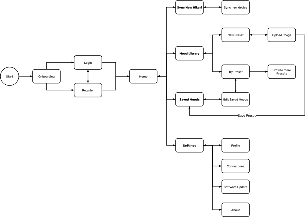
To transform insights from user-feedback into a clear structure, I designed the app flow to balance simplicity with functionality. The architecture begins with onboarding, guiding users seamlessly into login or registration before landing on the home screen.
From there, users can access core features such as the home/new device setup, mood library, saved moods, and settings, while secondary functions like profile, connections, and about remain easily accessible.
The mood library is central, allowing users to explore presets, use custom images and save favorite moods ensuring effortless personalization. This flow reduces clutter, prioritizes intuitive navigation, and supports the goal of enabling users to set the right mood with minimal effort.
app FLOw
style tyle
Typefaces
Color Palette
Icon Set
Logo
Space age
Logo
Rubik
Heading & Body
Rubik Bold 24px
H1
Rubik 21px
H2
Rubik 16px
Body 1
Rubik 14px
Body 2

#000000
#888888
#FFFFFF
Home
Mood Library
Saved Moods
Settings
Show Password
Full Brightness
Low Brightness
Edit
Add Device
Delete Mood
Account
H i K A r i
Cards
Navigation Bar

Buttons

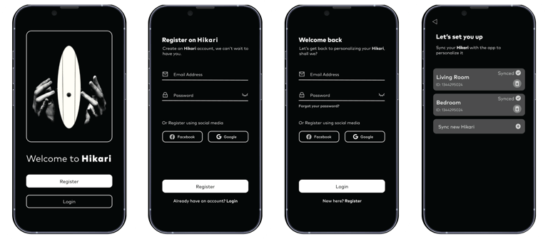
On Boarding
The onboarding flow introduces users to Hikari’s smart lighting ecosystem through a clean, guided setup experience. It walks users through device pairing, setting up the mood for a room, and presets.
Subtle micro-animations and visual feedback cues communicate connection status, ensuring a smooth and confident start even for first-time smart-lighting app users. The experience reduces setup friction and builds trust in the system.

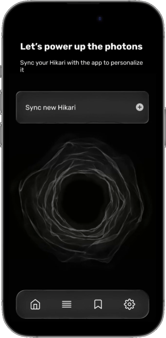
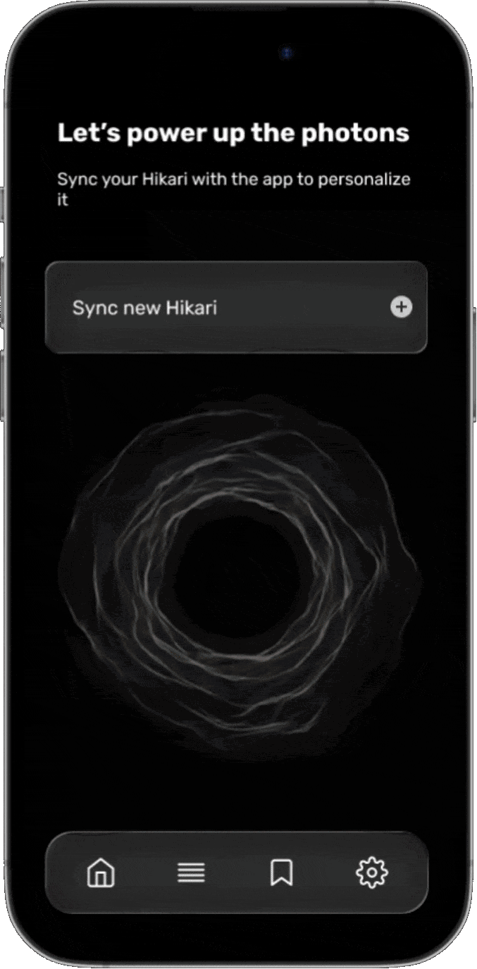
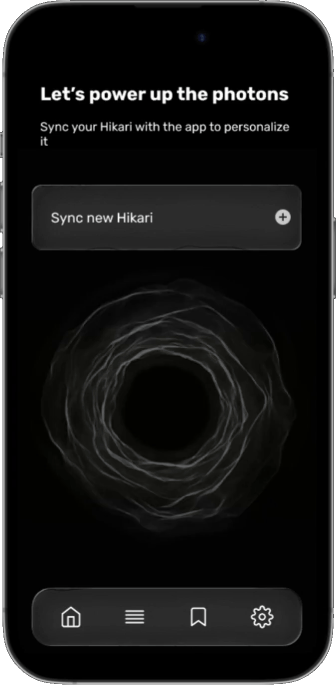
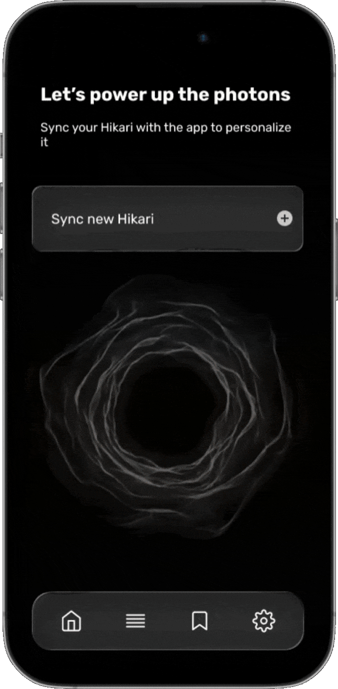
The Home page acts as the central control hub, giving quick access to syncing new Hikari, preset library, saved moods, and settings. A bottom navigation bar ensures thumb-friendly usability, while intuitive icons and clear hierarchy enhance discoverability.
The layout balances simplicity with functional depth, allowing users to navigate between basic controls and advanced features without cognitive overload.
Home
navigation & Core Interactions
From the Home page, users can seamlessly access all key experiences. Syncing new devices, browsing ambient moods, recalling saved presets, and customizing system preferences.
Each interaction is designed to be fluid, responsive, and visually communicative, embodying Hikari’s principle of human-centered lighting intelligence.
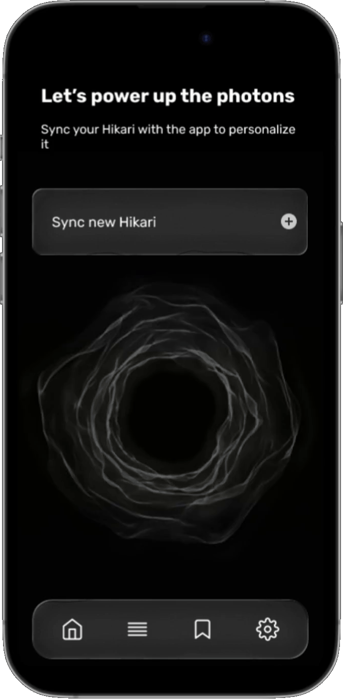
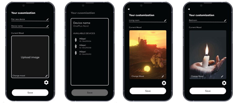
The Home page allows users to pair new Hikari devices effortlessly. A guided scanning animation visually indicates real-time device detection and connection progress.
Once discovered, users can assign devices to rooms or groups, reducing setup time and ensuring a smooth onboarding experience that reinforces the brand’s intuitive connectivity.
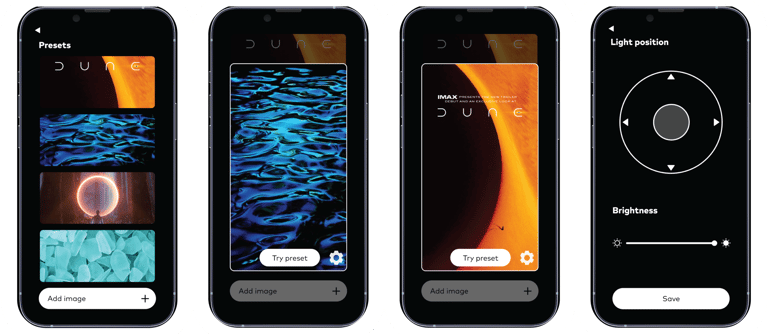
The Mood Library serves as a curated gallery of ambient presets inspired by natural light and emotion. Users can browse, preview, and apply lighting moods that instantly transform their environment.
Each mood card combines colour, brightness, and warmth profiles, offering one-tap ambience control and encouraging users to explore creativity through light.
The Settings screen provides users with fine-tuned control across the app’s ecosystem from account preferences and Bluetooth/Wi-Fi connections to linked device management and app updates.
The layout emphasises clarity and minimalism, ensuring advanced controls remain accessible without clutter. Every element supports the goal of maintaining user autonomy and transparency.
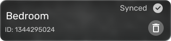
The Saved Moods section empowers users to store and recall personalized lighting setups. With clearly labelled thumbnails, users can quickly switch between favorite scenes or edit existing ones.
This creates a sense of ownership and continuity, turning everyday interactions with light into habitual rituals of comfort and mood expression.
Where emotion becomes illumination!