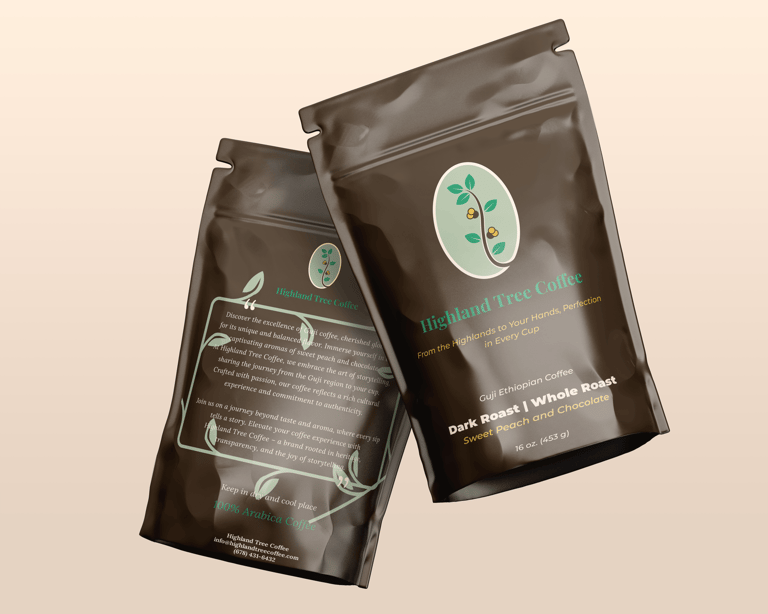
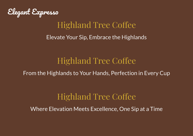
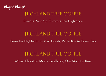
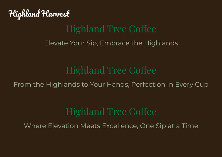
Highland Tree Coffee
From the Highlands to Your Hands, Perfection in Every Cup
Highland Tree Coffee is a home-grown specialty coffee brand that began as a kitchen-led passion project into a recognized regional brand in the state of Georgia. Founded by Emebet Mekenon and rooted in heritage-driven storytelling, cultural authenticity, and a deep respect for coffee’s origin.
The goal was to craft a timeless, premium brand identity that honors Ethiopian coffee culture while giving a warm, approachable, and trustworthy brand experience for a modern American audience.
CLIENT
Highland Tree Coffee
FOUNDER
Emebet Mekenon
LOCATION
Georgia, USA
SCOPE
Brand Strategy · Visual Identity · Packaging Design · Label System
Highland Tree Coffee traces its roots back to the Guji region of Ethiopia, one of the world’s most respected coffee-growing origins, known for its high elevation, fertile soil, and misty highlands that yield coffee with distinctive flavor notes and exceptional quality.
For the founder, this was deeply personal. What began as a shared ritual of authentic Ethiopian coffee among friends and family evolved into a scalable, community-driven brand. Highland Tree Coffee transcends product; it functions as a cultural bridge, connecting origin to home and heritage to community.
The brand narrative is structured around journey and transformation:
from the Ethiopian highlands → careful sourcing → thoughtful roasting → the final cup experience.
STORY
After exploring multiple naming and positioning directions, the client selected the Highland Harvest as a brand positioning which signified the roots of Guji coffee.

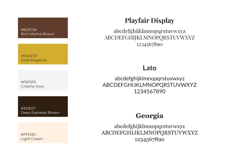

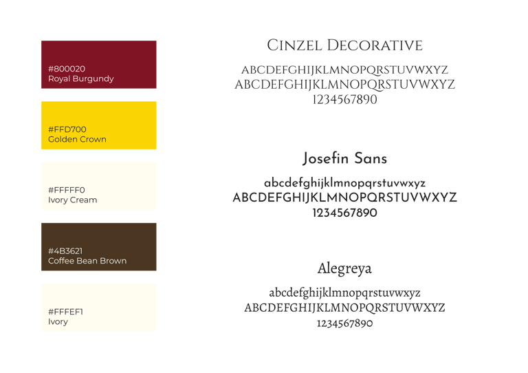
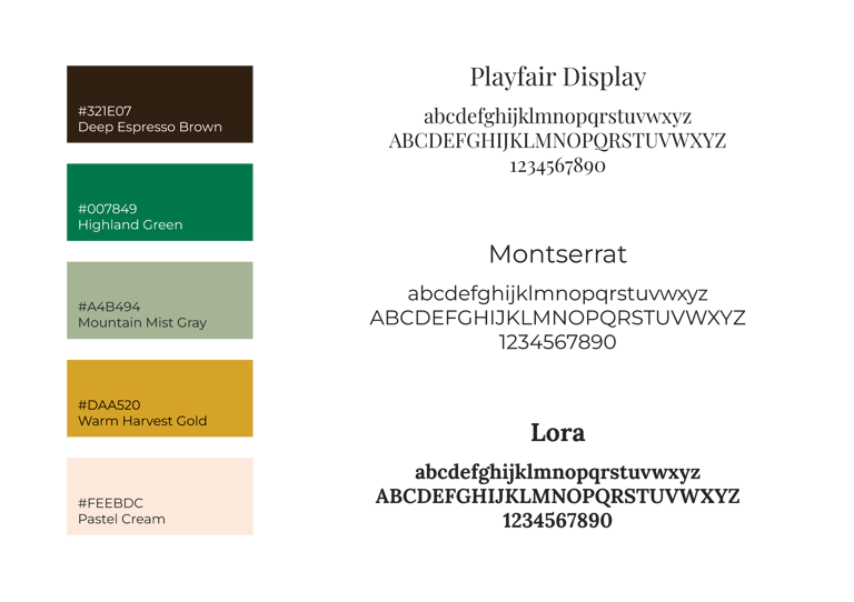
The typography system balances classic elegance with modern clarity:
Serif typefaces establish heritage and craft
Clean sans-serif fonts improve readability and retail clarity
VISION
To build a coffee brand that feels:
Rooted in heritage
Honest and transparent
Premium, yet welcoming
Story-driven rather than trend-driven
The identity needed to feel equally at home on a local shelf, in a café, or as a gift without losing its cultural authenticity.
TAGLINE
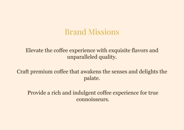
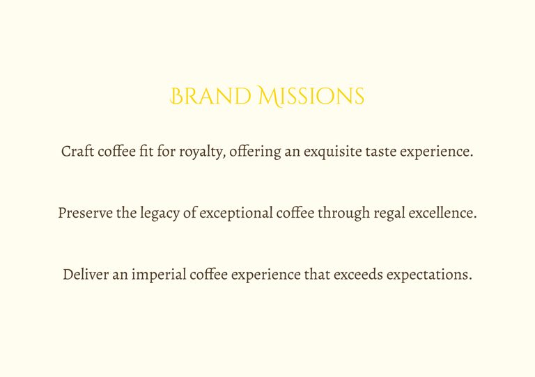
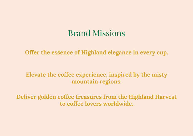
MISSION
From the Highlands to Your Hands, Perfection in Every Cup
To deliver golden coffee treasures from the highlands, offering an elevated coffee experience inspired by misty mountain regions and rich cultural heritage.
This direction allowed the brand to:
Emphasize origin and elevation
Celebrate coffee as a crafted harvest
Balance premium quality with warmth
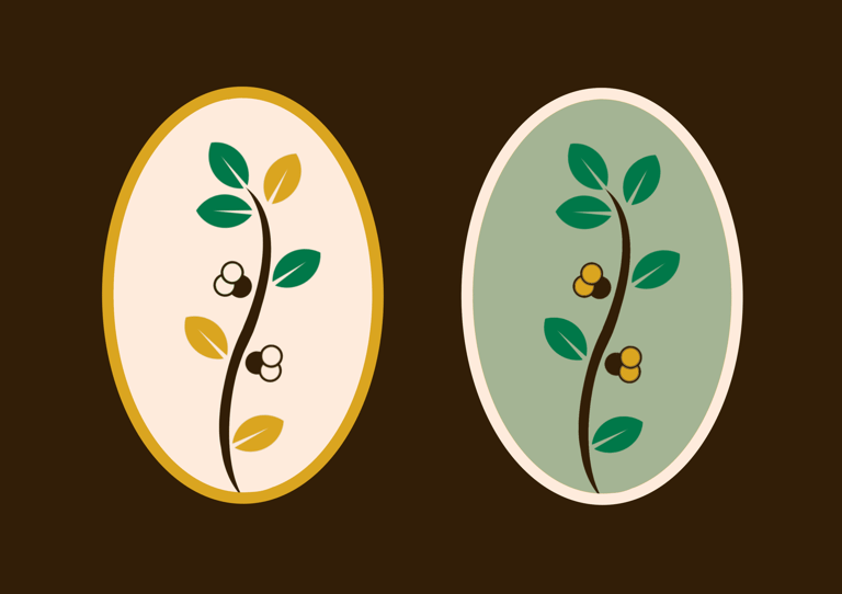
Parallel explorations focused on growth and nature, expressed through leaf motifs, branching structures, and organic curves. These forms were used to reinforce themes of cultivation, care, and sustainability, directly referencing the agricultural roots of Guji coffee.
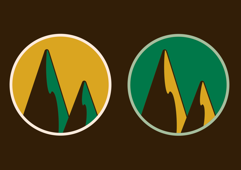
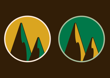
Other iterations explored balance and harmony, translating the smooth, nuanced flavor profile of Guji coffee into symmetry, flow, and visual rhythm. This helped ensure the mark felt considered, calm, and refined, rather than aggressive or ornamental.
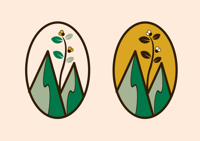

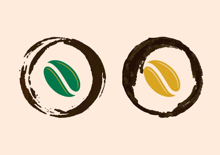
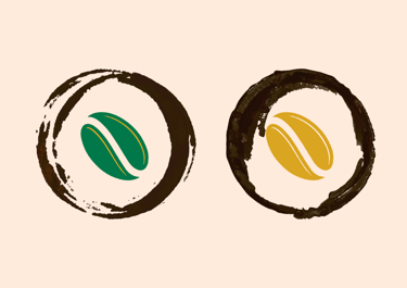
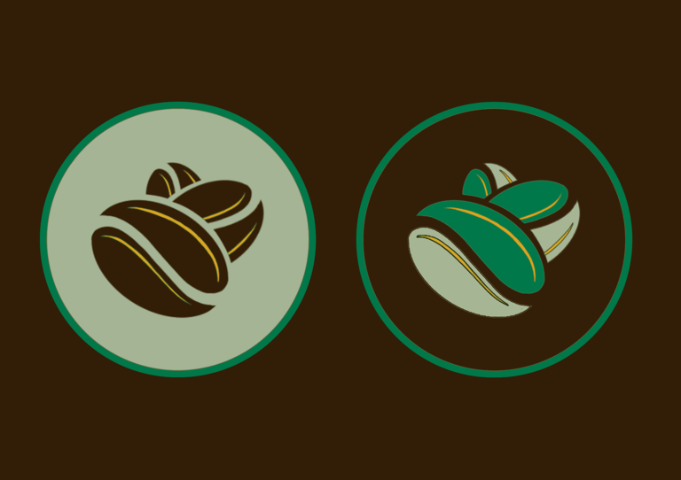
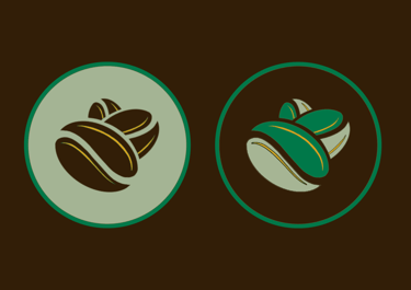
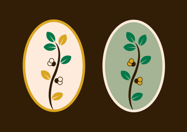
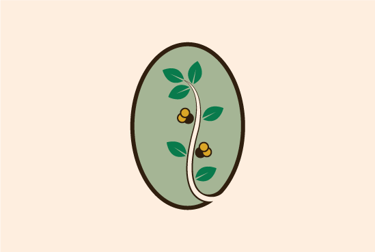
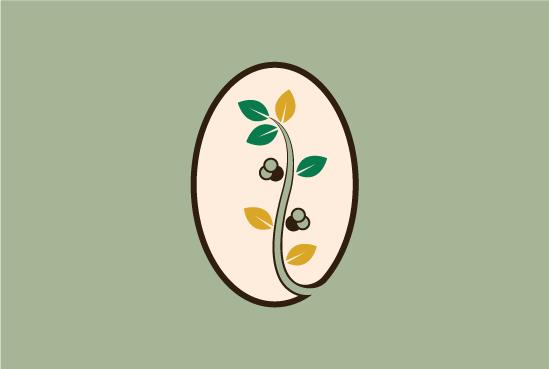
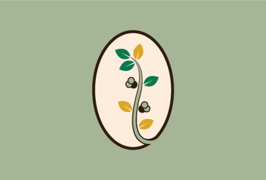
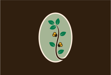
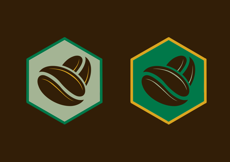
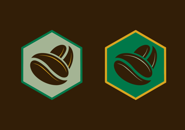
The logo exploration began by investigating the coffee bean as a primary symbol of origin, using its form to communicate authenticity, provenance, and craft. Multiple abstractions were tested ranging from literal representations to simplified, symbolic forms to identify a mark that felt timeless rather than illustrative.
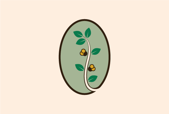
The chosen logo synthesizes these explorations by combining an abstract coffee bean with organic coffee plant elements, resulting in a symbol that communicates growth, stewardship, and journey of the coffee from Ethiopian Highlands to the customers cup.
The logo aesthetics are calm, grounded, and natural intentionally avoiding short-term visual trends in favor of longevity, scalability, and brand endurance.

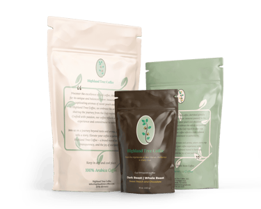
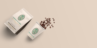
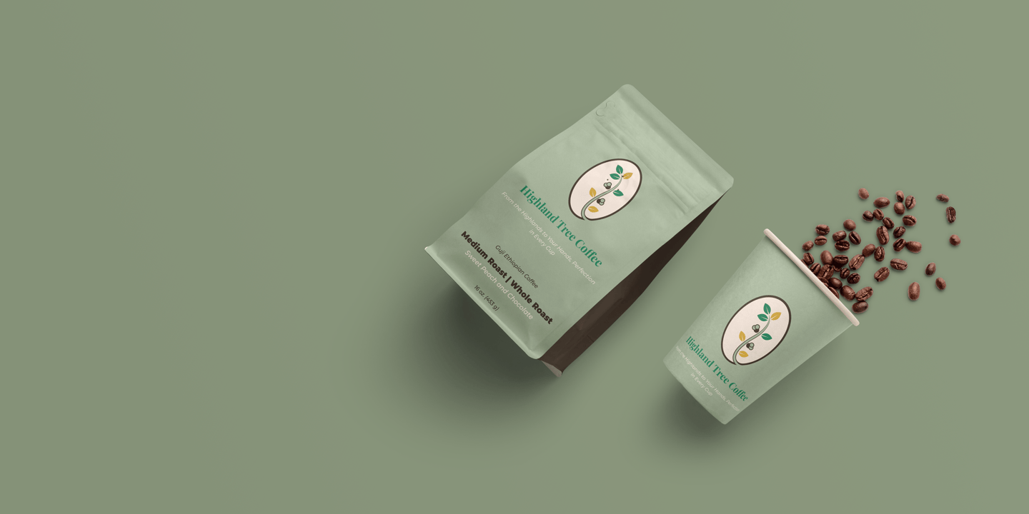
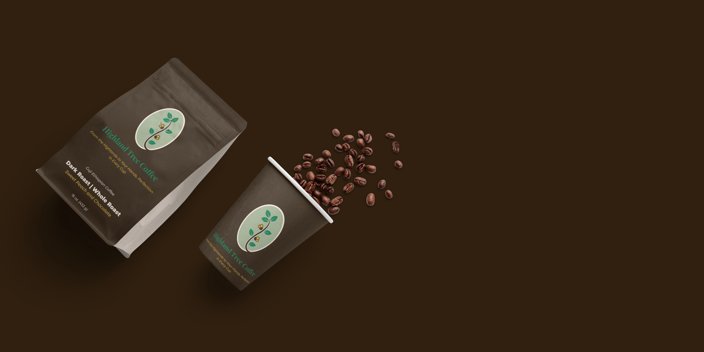
A single master identity is supported by a three-color system to clearly differentiate roast profiles while maintaining brand consistency.

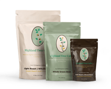


Fresh, airy, and bright tones
Reflects the floral and fruity notes of Guji coffee
Conveys lightness and clarity
Balanced earthy greens and warm neutrals
Represents smoothness and harmony
Designed as the most versatile, everyday offering
Deeper, richer tones with stronger contrast
Communicates boldness and intensity
Feels grounded and robust without appearing harsh